-
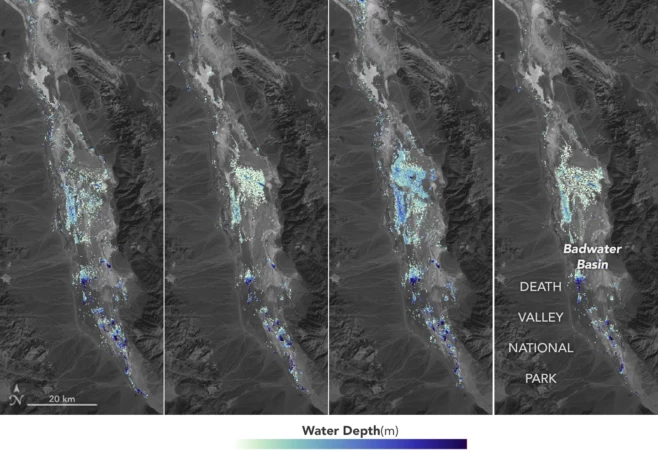
California’s Death Valley, the driest place in North America, has hosted an ephemeral lake since late 2023. A NASA-led analysis recently calculated water depths in the temporary lake over several weeks in February and March 2024, demonstrating the capabilities of the U.S.-French Surface Water and Ocean Topography (SWOT) satellite, which launched in December 2022. The analysis found
-
April 2nd, 2024
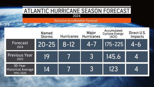
AccuWeather Forecasts Explosive 2024 Hurricane SeasonAccuWeather’s team of expert meteorologists is warning people and businesses to start preparing for a frenzy of tropical activity that could have major impacts on the United States this hurricane season. The AccuWeather 2024 Atlantic Hurricane Season Forecast calls for 20 to 25 named storms. Eight to 12 of those storms are forecast to strengthen into hurricanes. Four to six
-
March 18th, 2024
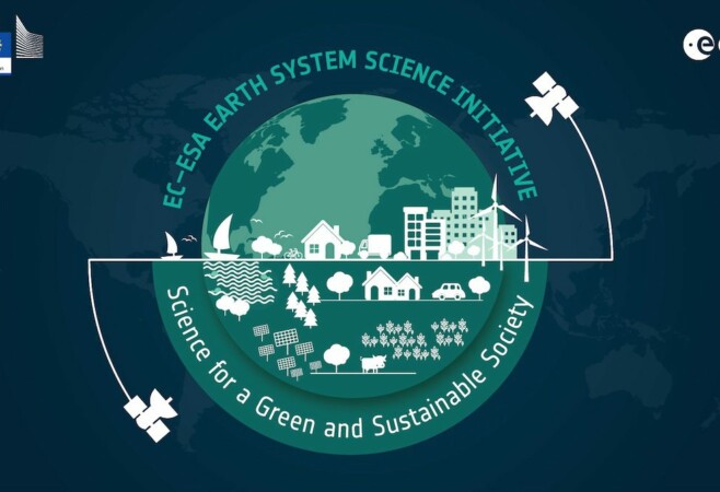
Joining Forces on the Complexities of Clouds and AerosolsThe European Commission (EC) and the European Space Agency (ESA) launched the Earth System Science Initiative to provide a coordinated response to critical environmental challenges and related scientific questions. The EC’s Research and Innovation Department and ESA’s Earth Observation Programmes Directorate are aligning a set of selected scientific activities under their respective Horizon Europe and
-
New research suggests that sunlight-blocking particles from an extreme eruption would not cool surface temperatures on Earth as severely as previously estimated. Some 74,000 years ago, the Toba volcano in Indonesia exploded with a force 1,000 times more powerful than the 1980 eruption of Mount St. Helens. The mystery is what happened after that—namely, to